Analytics
Analytics is where your team turns everyday activity into reports. You build dashboards from the data Teloring already collects — conversations, messages, agents, your objects (customers, contacts, orders, anything you built), form submissions, and e‑signatures — and lay them out as cards on a free‑form canvas.
Every report is a small recipe: pick a data source, choose what to measure, optionally group it, filter it, and choose how to show it (a number, a chart, a gauge, or a table). Teloring runs the recipe on demand against your live data and caches the result for speed.
Use Analytics to answer questions like "How many conversations did we open per channel this month?", "Which agent resolves the most chats?", "How many documents were signed vs declined?", "What is the average rating from our feedback form?", or "Which conversations have had no agent reply in over an hour?".
Key facts
| Fact | Meaning |
|---|---|
| Reports are recipes, not snapshots | A report describes how to query your data. It always reflects live data when opened or refreshed. |
| Account‑isolated | A report only ever reads your own account's data. |
| Dashboards have tabs | Group related reports into tabs. Every dashboard starts with an Overview tab. |
| Free‑form canvas | Drag cards to move them and pull the edges to resize. Positions are saved automatically. |
| All time by default | A new report shows all matching data. You narrow the time window with a date filter on the report itself. |
| Filters are flexible | Combine conditions with All (AND) or Any (OR) on any field, including dates and custom fields. |
| Each card has its own design | Colors, number formatting, legends, axes, gauge bands, and table columns are set per card. |
| See the raw rows | Every card has View data to inspect the exact records behind the number — and export them to Excel or PDF. |
| Pin a tab to the home page | Any tab can replace the default boxes on the main dashboard home — for everyone in the account, or just for you. |
| Build reports with AI | Describe the report you want in plain language and AI fills in the builder for you (when AI Reports & analytics is enabled). |
Who uses Analytics
| Role | Typical use |
|---|---|
| Admins | Build dashboards, design cards, and define the reports the team relies on. |
| Team managers | Track volume, response times, agent workload, channel mix, signatures, and form results. |
| Agents | Open shared dashboards to see queues, their own workload, and daily totals. |
The Analytics workspace
Open Analytics from the Teloring sidebar.
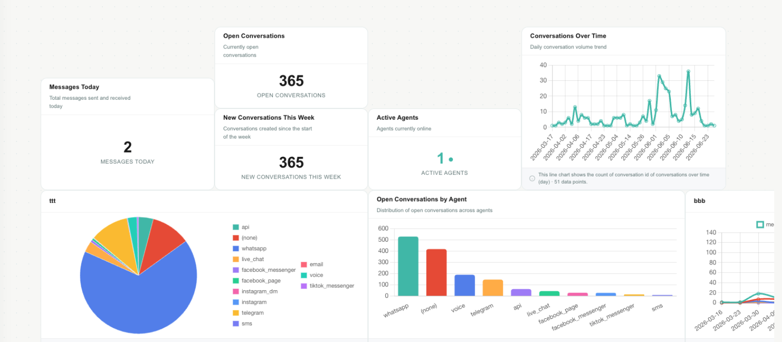
The workspace has three parts:
| Area | Use it to |
|---|---|
| Tabs (top left) | Switch between tabs. The Overview tab is always present and cannot be deleted. |
| Top bar (top right) | Add Report opens the report builder. Refresh re‑runs every card on the current tab. Add tab creates a new tab. Tab settings (the gear) renames, reorders, deletes, or pins the current tab — see Tab settings. |
| Canvas | The grid where report cards live. Drag, resize, zoom, and pan here. |
Tabs
Tabs let you organize reports by theme — for example Overview, Conversations, Agents, Sales, or Documents.
| Action | How |
|---|---|
| Switch tab | Click the tab name. |
| Add tab | Click the Add tab button and type a name. |
| Rename, reorder, delete, or pin a tab | Open Tab settings (the gear in the top bar) — see below. |
The Overview tab auto‑refreshes so it always shows current numbers. It cannot be deleted.
A 📌 next to a tab name means that tab is currently shown on the main dashboard home page (see Show a tab on your main dashboard).
Tab settings
Click the gear button in the top bar to open settings for the current tab.
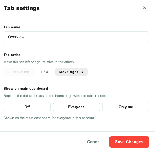
| Setting | What it does |
|---|---|
| Tab name | Rename the tab. Click Save changes to apply. |
| Tab order | Move the tab left or right relative to the other tabs with the Move left / Move right buttons. The current position (for example 2 / 4) is shown between them. |
| Show on main dashboard | Pin this tab to the dashboard home page — Off, Everyone, or Only me. See Show a tab on your main dashboard. |
| Danger zone → Delete tab | Permanently delete the tab and all of its reports. Hidden for the Overview tab, which cannot be deleted. |
Renaming and reordering apply for everyone in the account. Deleting a tab also deletes every report on it and cannot be undone.
Canvas controls
| Control | What it does |
|---|---|
| Drag a card | Click and hold the card header (or top edge) and move it. Cards snap to a light grid. |
| Resize a card | Drag any corner or edge. |
| Zoom | Use the zoom buttons in the corner: zoom out, zoom in, Fit all, and reset to 100%. |
| Pan | Drag an empty area of the canvas to move the whole view. |
Moving and resizing are saved automatically.
Show a tab on your main dashboard
The main dashboard — the home page you land on — normally shows four summary boxes (open conversations, waiting in line, resolved today, and agents online) above your recent conversations. You can replace those boxes with any analytics tab, so the metrics your team cares about are the first thing they see.
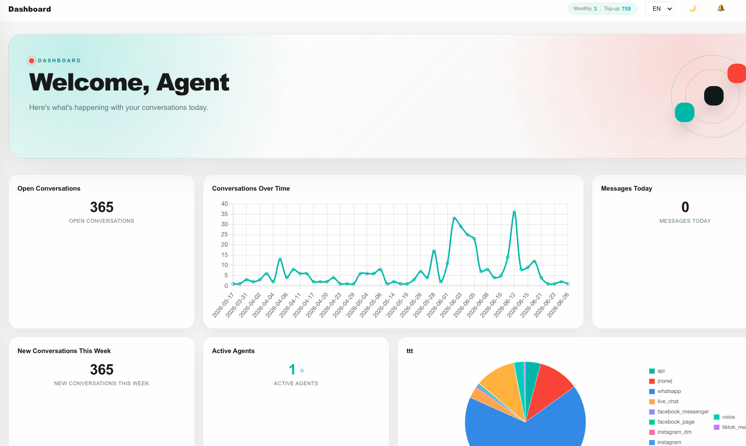
Open Tab settings for the tab you want to feature and choose under Show on main dashboard:
| Choice | Who sees it | Notes |
|---|---|---|
| Off | — | The home page shows the default four boxes again. |
| Everyone | Everyone in the account | One shared "company front page". Pinning a tab replaces whatever was pinned for everyone before. |
| Only me | Just you | Your personal home page. Other agents are not affected. |
How Teloring decides what each person sees on their home page:
- If you pinned a tab Only me, you see that tab.
- Otherwise, if a tab is pinned for Everyone, you see that tab.
- Otherwise, you see the default four boxes.
So a personal pin always wins for you, and turning a pin Off brings the default boxes back. Only one tab can occupy each position (Everyone / Only me) — pinning a new tab replaces the previous one.
The pinned tab's reports are shown in a clean, automatically arranged grid (not the free‑form canvas) and refresh on their own. Your recent conversations still appear below them.
A pinned tab reads the same account‑isolated data as everywhere else in Teloring, so each person only ever sees their own account's numbers.
How a report works
Every report is built from a few simple choices. Understanding these makes the rest of Analytics easy.
| Choice | Question it answers | Example |
|---|---|---|
| Data source | What records am I reporting on? | Conversations |
| Measurement | What number do I want? | Count |
| Grouping | How should the number be split? | By channel type |
| Time | If it's a trend, what time bucket? | By month |
| Filters | Which records should be included? | Only WhatsApp, only this month |
| Report type | How should it look? | Bar chart |
| Goal | What target do I compare against? | 500 |
| Design | What colors and formatting? | Brand colors, no decimals |
A report named "Open conversations by channel" is simply: data source = Conversations, measurement = Count, grouping = Channel type, filter = Status is Open, report type = Bar chart.
Create a report
- Open Analytics and choose the tab where the report should live.
- Click Add Report.
- Step 1 — pick a report type.
- Step 2 — configure the report (title, data source, measurement, grouping, filters, and more).
- Click Create Report.
The card appears on the canvas and runs immediately. To change it later, hover the card and click Edit.
Build a report with AI
If your account has AI Reports & analytics enabled (in AI World), you can describe the report you want in plain language and let AI build it — instead of filling in every field yourself.
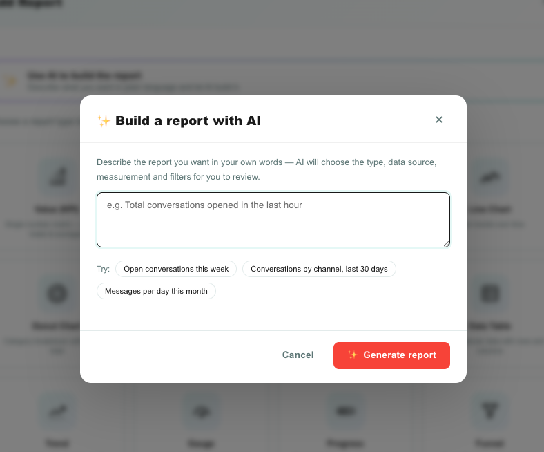
- Click Add Report. At the top of the report‑type step you'll see ✨ Use AI to build the report (the same button also appears in the top‑right while you configure a report). Click it.
- Describe the report in your own words — for example "conversations resolved each day in the last week" or "open conversations by channel". You can click an example chip to start.
- Click Generate report.
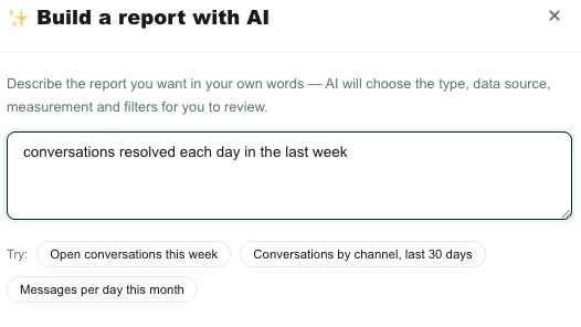
AI chooses the report type, data source, measurement, grouping, time range, and filters, then opens the builder on Step 2 with everything pre‑filled so you can:
| Then | How |
|---|---|
| Use it as‑is | Click Create Report. |
| Adjust it | Change any field — title, measure, grouping, filters, design — before creating. |
| Try again | Click ✨ Use AI again and enter a new description (a new description replaces everything). |
AI only builds reports from data Teloring actually stores. If you ask for something it can't answer — such as a general‑knowledge question — it tells you it can't build that report rather than inventing one. Nothing is created until you click Create Report.
The button is hidden when AI Reports & analytics is off. Ask an administrator to enable it in AI World if you don't see it.
Step 1: Choose a report type
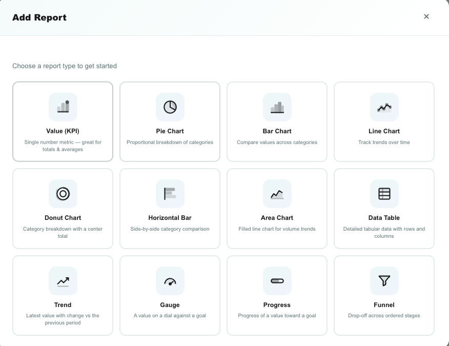
Report types fall into four groups.
Single‑number cards
| Type | Shows | Best for |
|---|---|---|
| Value (KPI) | One big number. | Totals like "Open conversations" or "Messages today". |
| Trend | A big number plus the % change vs the previous period, with a small sparkline. | "New conversations this week vs last week". |
| Gauge | A speedometer of the number against a goal, with colored bands. | "Resolved today" toward a daily target. |
| Progress | A progress bar of the number against a goal, with a percentage. | "Signed documents this month vs a 100 target". |
Breakdown charts
| Type | Shows | Best for |
|---|---|---|
| Pie | Proportional slices. | Share of conversations by channel. |
| Donut | Pie with the total in the center. | Same as pie, with the grand total visible. |
| Bar | Vertical bars per group. | Conversations per agent. |
| Horizontal bar | Bars laid out left to right. | Long group names, like inbox names. |
| Stacked bar | Bars split by a second dimension. | Conversations per channel, split by status. |
Time charts
| Type | Shows | Best for |
|---|---|---|
| Line | A line over time. | Daily or monthly conversation volume. |
| Area | A filled line over time. | The same trend with emphasis on volume. |
Detail and special
| Type | Shows | Best for |
|---|---|---|
| Table | Rows of data — either raw records or a grouped summary. | Listing records, or "Channel type | count" summaries. |
| Funnel | Sequential stages you define. | Step‑by‑step drop‑off, such as lead → qualified → won. |
Step 2: Configure the report
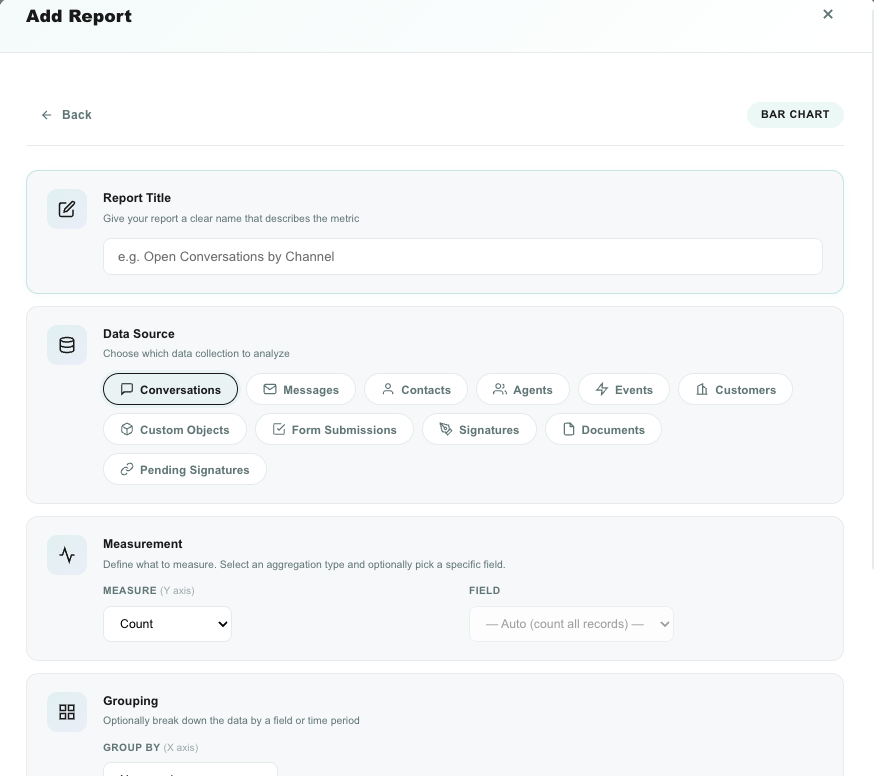
The builder shows only the sections that apply to the report type you chose.
Title
A clear name for the card, such as Open conversations or Signed documents this month.
Data source
The data source is the kind of record the report reads. Click a source to select it.
| Data source | What it contains |
|---|---|
| Conversations | Every conversation, with channel, status, assigned agent, assigned team, priority, timestamps, message counts, and your account's conversation attributes. |
| Objects | Any object — Customers, Contacts, Calls, Documents and the ones you built (orders, deals, products…). Pick the object after choosing this source, then Records or Changes. See Objects below. |
| Messages | Individual messages across all conversations (direction, sender type, content type, channel). |
| Agents | Individual team members (role, active status, login activity). |
| Teams | Team records — team size and routing rules. Not the conversations a team handled; see the note below. |
| Events | System activity events. |
| Form Submissions | Submitted form answers. Optionally pick one form to analyze its questions. |
| Signatures (signed) | Completed and declined e‑signature sessions. |
| Documents (templates) | Signature document templates. |
| Pending signatures | Signature links that were sent but not yet signed. |
When you pick Objects or Form Submissions, an extra selector appears so you can choose the object or the form. The available fields then update to match it.
If your account uses Conversation Attributes — fields such as Reason for contact, Outcome, or Refund amount — they appear in the field lists of the Conversations source under their own labels. No extra selector is needed: an account has one attribute set, so they are always available.
What each one can do follows its type: dropdown, radio, multi-select and agent-picker attributes can be grouped by; number and currency attributes can be summed and averaged; date attributes drive time grouping; text attributes are for filtering.
Two different questions, two different sources:
- "How much work did each team handle?" → data source Conversations, grouping Assigned Team. That is where volume, resolution time, priority, and channel live. Team IDs display as team names, and conversations with no team group under
(none). - "How are our teams set up?" → data source Teams. It answers how many teams exist, how big they are (Agents in Team, with average / sum / min / max), which use Auto-assign to Online Agent or Human Agents Only, and who created them.
See Teams.
Objects
Every table under Objects is a data source, with every one of its fields:
| What you pick | What you get |
|---|---|
| Object | Customers, Contacts, Calls, Documents, or any object you built. Only objects your role may read are listed. |
| Records | One row per record. Group by any dropdown, checkbox, multi-select, agent or linked record field; sum or average numbers and currencies; filter on anything. Linked records and agents appear by name, a dropdown's own colours colour the chart, and a linked-record filter lets you pick the record by name. |
| Changes | One row per change of a record — which field, from what to what, by whom, when. Chart deals moved to Won per week or who edits the most. Only objects with Keep a change history for reports switched on in the builder have it, and only from that moment on. |
| Date field (Records) | The date a time chart plots by: Created, Updated, or any date field of the object (delivery date, renewal date). |
| Use the dashboard dates (Records) | Off by default — an object is a table, so a report covers every record. Switch it on to apply the dashboard's date range to the chosen date field. Changes always follow the dashboard dates. |

The AI report builder knows your objects too: ask for a chart of all orders by status, customers by lifecycle stage or total order amount per month, in any language, and it picks the object and the fields.
Measurement
Measurement is the number the report calculates.
| Measure | What it returns |
|---|---|
| Count | The number of matching records. This is the most common measure (for example, number of conversations). |
| Count (distinct) | The number of unique values in a field (for example, distinct contacts). |
| Sum | The total of a numeric field (for example, sum of message counts, or total deal value). |
| Average | The average of a numeric field (for example, average rating). |
| Minimum / Maximum | The lowest or highest value of a numeric field. |
Count counts records — it does not need a field. Choose Count for "how many conversations". To total a numeric field such as message volume or deal value, choose Sum and pick the field (for example, Message count).
Grouping
Grouping splits the measurement into categories. For a bar or pie chart this is the breakdown; for a table it turns the report into a grouped summary.
| Setting | Meaning |
|---|---|
| Group by | The field to split by, such as Channel type, Status, Assigned agent, or a custom field. Leave it empty for a single total. |
| Time granularity | For line, area, and trend reports — the time bucket: Hour, Day, Week, or Month. |
A table with a grouping shows two columns: the group and its measure (for example, Channel type | Count). A table with no grouping lists raw rows — see Fields to show.
Fields to show (tables only)
For a raw‑rows table, choose which columns appear. Each available field is a checkbox. Leave grouping empty to use this mode.
Goal (trend, gauge, and progress)
Trend, gauge, and progress compare the number to a goal. Set the goal in one of two ways:
| Goal source | Meaning | Example |
|---|---|---|
| Fixed number | You type a target. | A goal of 500. |
| Calculated | The goal is itself a measurement, defined with its own measure and filters. | Goal = number of conversations created last month, so this month is compared to last month automatically. |
| Report type | How the goal is used |
|---|---|
| Progress | Fills a bar to value ÷ goal and shows the percentage. |
| Gauge | Points the needle at the value within the goal range, across colored bands. |
| Trend | Compares the latest period to the previous period and shows the % change (up or down). A goal can also be displayed for reference. |
Funnel stages
For a funnel, add a stage for each step. Each stage has a label and its own set of filters. Stages are shown in order with the drop‑off between them.
Filters
Filters decide which records are included. This is the most powerful part of the builder — see Filtering data below.
When you are done, click Create Report (or Save Changes when editing).
Filtering data
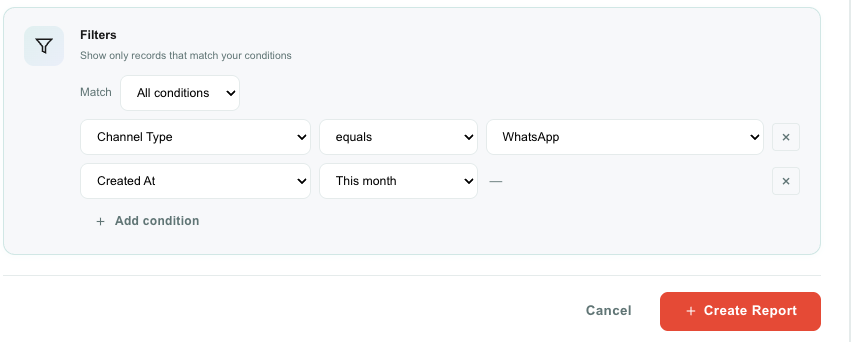
A filter is a set of conditions. You choose how they combine:
| Match mode | Meaning |
|---|---|
| All conditions | A record is included only if every condition is true (AND). |
| Any condition | A record is included if at least one condition is true (OR). |
Click Add condition to add a row. Each condition has three parts:
| Part | Meaning |
|---|---|
| Field | Which field to test (for example, Channel type, Status, Created at, or a custom field). |
| Operator | How to compare (equals, is any of, contains, before, in the last…, and more). |
| Value | What to compare against. Where the value is a known list — inboxes, agents, status, channel type — Teloring shows a dropdown instead of a text box, so you don't have to guess. |
Operators for text, numbers, and lists
| Operator | Use it to |
|---|---|
| Equals / Not equals | Match an exact value. |
| Is any of / Is none of | Match against several values at once (for example, Status is any of Open, Missed). |
| Contains / Doesn't contain | Match part of a text value, or membership in a list field such as tags. |
| Starts with / Ends with | Match the beginning or end of a text value. |
| Greater than / less than (and or‑equal) | Compare numbers. |
| Between | Match a numeric range. |
| Is empty / Is not empty | Match records that have no value, or any value, in the field. |
Operators for dates
Date fields (Created at, Resolved at, Last message at, custom date fields, and so on) offer a rich set of time operators. They are relative — they always move with the current date.
| Group | Operators |
|---|---|
| Exact | On date, Not on date, Before date, After date, Between dates. |
| Relative (you choose a number + unit) | In the last…, In the next…, More than … ago. Units are minutes, hours, days, weeks, or months. |
| Day | Today, Yesterday, Tomorrow, Today & yesterday, Today & tomorrow. |
| Week | This week, Last week, Next week, 2 weeks ago, Next 2 weeks. |
| Month | This month, Last month, Next month, Last 2 months, Next 2 months. |
| Quarter | This quarter, Last quarter, Next quarter, Q1–Q4 of this year. |
| Year | This year, Last year, Next year. |
| Rolling | In the last hour / 2 hours, Last 30 / 60 / 90 days, Next 30 / 60 / 90 days. |
| Presence | Has a value, Has no value. |
Future windows (such as Next month or In the next 30 days) return nothing for "created" dates, because records cannot be created in the future. They are useful for custom date fields that hold future dates, such as a renewal date or a scheduled callback.
Filtering by a specific inbox
Conversations and signatures store the inbox in the Inbox field. Filter Inbox and pick the channel by name (for example, secret project WA (WhatsApp)) to report on one inbox. Filter Channel type instead to report on a whole channel (for example, all Telegram inboxes).
Messages do not store which inbox they belong to — only the channel type. To report on messages from one specific inbox, report on Conversations for that inbox, or filter Messages by Channel type.
Studio‑handled conversations
When a Studio flow handles a conversation, no agent is assigned. To find or group these conversations, use the conversation fields Handled by Studio (filter "is not empty") and Studio Flow (group by it to see the breakdown per flow).
Designing how a card looks
Each card has its own appearance. Hover a card and click the design (palette) action to open the Design panel. Changes preview live; click Save to keep them, Reset to return to defaults, or Cancel to discard.
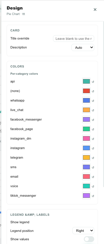
The panel shows only the sections that apply to the card type.
| Section | Applies to | What you can change |
|---|---|---|
| Card | All | A title override and, for number cards, the number color and size. |
| Numbers | Cards with numbers | Decimal places, thousands separator, prefix (such as $), suffix (such as min), a multiplier, percent/plain style, and compact form (1.2k, 3.5M). |
| Colors | Charts | A single series color and, when there are categories, a color per category. Bars can also highlight the largest value. |
| Legend & labels | Charts | Show or hide the legend and its position, show values on the chart, and show percentages (pie/donut). |
| Axes & grid | Bar, line, area | Show grid lines, axis titles, start the axis at zero, set min/max, smooth lines, and area fill opacity. |
| Gauge | Gauge | The minimum value and the color bands (each band has an upper limit and a color). |
| Progress | Progress | The bar color and whether the percentage is shown. |
| Trend | Trend | Which direction is "good" (so up or down shows green), and whether the sparkline is shown. |
| Table | Table | Striped rows, compact rows, and a columns manager to show/hide columns, rename headers, and reorder them. |
Design is saved per card, so two cards built from the same data can look completely different.
Working with a card
Hover a report card to reveal its actions.
| Action | What it does |
|---|---|
| View data | Opens the records behind the card in a full‑screen table. |
| Edit | Reopens the report builder to change the recipe. |
| Design | Opens the design panel described above. |
| Refresh | Re‑runs just this card against live data. |
| Delete | Removes the card from the tab. |
View data and export (Excel & PDF)
View data answers "where does this number come from?". It opens a full‑screen page with the exact records the card counted, and a Back button to return to your dashboard.
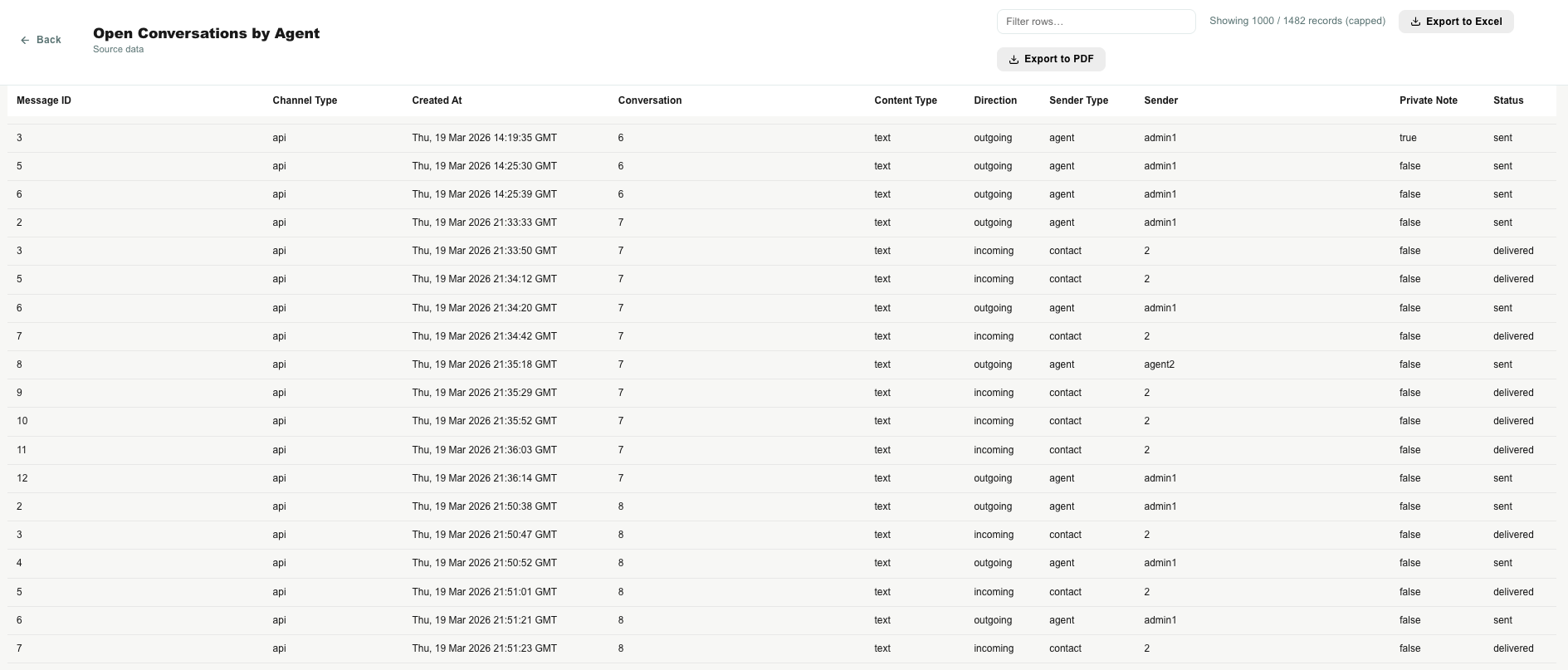
In the data view you can:
| Action | How |
|---|---|
| Filter the rows | Type in the search box to narrow the visible rows. |
| Sort | Click a column header to sort by it; click again to reverse. |
| Export to Excel | Click Export to Excel to download an .xlsx file of the rows. |
| Export to PDF | Click Export to PDF to download a polished, shareable PDF — the report's chart (when it has one) followed by the data table. |
Both exports download to your computer. The PDF is a good‑looking report you can send to someone directly; the Excel file is best when they want to work with the raw data in a spreadsheet. This is also the fastest way to verify a report before you trust it.
Date ranges
There is no global date picker. Instead, each report controls its own time window through a date filter. This keeps every card honest about what it is showing.
| You want | Do this |
|---|---|
| All‑time totals | Add no date filter — the report includes everything. |
| A fixed window | Filter a date field, for example Created at is Between two dates. |
| A rolling window | Filter a date field with a relative operator, for example Created at is This month or In the last 7 days. |
Because the operators are relative, a report set to This month keeps showing the current month as time passes — no editing needed.
Worked examples
These recipes show how the pieces fit together.
| Goal | Data source | Measure | Grouping | Filters | Type |
|---|---|---|---|---|---|
| Open conversations right now | Conversations | Count | — | Status is Open | Value |
| Conversations per channel this month | Conversations | Count | Channel type | Created at is This month | Bar |
| Daily message volume | Messages | Count | Time = Day | Created at is In the last 30 days | Line |
| Telegram messages, May–June | Messages | Count | — | Channel type is Telegram; Created at Between 1 May and 30 Jun | Value |
| Signed vs declined documents | Signatures (signed) | Count | Status | — | Pie |
| Average feedback rating | Form Submissions (pick the form) | Average | — | — | Value |
| Deals won this quarter | Objects → Deals (Records) | Count | — | Stage is Won; Created at is This quarter | Value |
| Orders by status | Objects → Orders (Records) | Count | Status | — | Pie |
| Order total per month | Objects → Orders (Records) | Sum of Amount | Time = Month | Use the dashboard dates on Created at | Line |
| Customers by lifecycle stage | Objects → Customers (Records) | Count | Lifecycle stage | — | Donut |
| Deals moved to Won per week | Objects → Deals (Changes) | Count | Time = Week | Field is Stage; New value is Won | Line |
| Conversations with no agent reply in over an hour | Conversations | Count | — | Last message direction is Incoming; Last message at is More than 1 hour ago; Status is any of Open, Missed | Value |
| Messages per inbox (one WhatsApp number) | Conversations | Sum of Message count | Inbox | Inbox is (your WhatsApp inbox) | Horizontal bar |
| Open conversations by team | Conversations | Count | Assigned Team | Status is Open | Bar |
| Average resolution time by team | Conversations | Average of Resolution time (ms) | Assigned Team | Resolved at is This month | Horizontal bar |
| Sales queue with nobody on it | Conversations | Count | — | Assigned Team is Sales; Assigned agent is empty | Value |
| Agents per team | Teams | Average of Agents in Team | — | — | Value |
| Teams using auto-assignment | Teams | Count | Auto-assign to Online Agent | — | Pie |
| What are people contacting us about? | Conversations | Count | Reason for contact (attribute) | Created at is This month | Pie |
| Which contact reasons take longest | Conversations | Average of Resolution time (ms) | Reason for contact (attribute) | Resolved at is This month | Horizontal bar |
| Total refunded this month | Conversations | Sum of Refund amount (attribute) | — | Resolved at is This month | Value |
| Outcomes by channel | Conversations | Count | Channel type, stacked by Outcome (attribute) | — | Stacked bar |
Tips
| Tip | Why it helps |
|---|---|
| Name reports clearly | A good title explains the card at a glance on a shared dashboard. |
| Use View data to verify | Confirms the number is built from the records you expect before you trust it. |
| Prefer relative date filters | "This month" or "In the last 7 days" stays correct over time without editing. |
| Use Count for records, Sum for totals | Count answers "how many"; Sum answers "how much" of a numeric field. |
| Group tables for summaries | A grouped table is the simplest way to get a "category → count" list you can export. |
| Keep one theme per tab | Separate Overview, Conversations, Agents, and Sales into tabs so each stays readable. |
Troubleshooting
| Problem | What to check |
|---|---|
| The number looks too low | Check the report's date filter. With no date filter it shows all time; with a relative filter such as This week it only shows that window. |
| Two cards disagree | Make sure both use the same filters. Use View data on each to compare the underlying records. |
| "Invalid report recipe" when saving | A filter condition is incomplete — for example, In the last… with no number, or Between missing a value. Complete the condition and save again. |
| A status filter misses conversations | The conversation list treats Open as Open + Missed. To match it, filter Status is any of Open, Missed. |
| An object or form shows no fields | Re‑select the object or form so its fields load. |
| The Changes source of an object is empty | Switch on Keep a change history for reports in the object's builder; only changes made after that are recorded. |
| A grouped report shows "(none)" | Some records have no value in the grouping field. That is expected; filter it out if you don't want it. For a conversation attribute, a large (none) group usually means conversations from before the attribute existed, or that the team is not filling it in yet. |
| A conversation attribute isn't in the field list | Make sure the data source is Conversations. Text and text-area attributes can be filtered on but not grouped by — use a dropdown or multi-select attribute for grouping. |
| Studio‑handled conversations show no agent | They are not assigned to an agent. Use Handled by Studio or Studio Flow to report on them. |
| A report needs a Firestore index | Only the Changes source of an object needs a one‑time database index. If a card shows an index warning, ask your administrator to create it. |
| The Use AI button isn't showing | AI Reports & analytics is turned off. An administrator can enable it in AI World. |
| My pinned tab isn't on the home page | A personal pin (Only me) overrides an account pin for you. Check Tab settings → Show on main dashboard; set it Off to bring back the default boxes. |
| AI says it can't build my report | The request asks for something Teloring doesn't store, or is too vague. Describe a metric over your data, e.g. "open conversations by channel this month". |